Updates! Updates! Updates!

UPDATES!

As many of you can see, I've been a pretty terrible blogger lately! What can I say...Life.
Showing posts with label Art. Show all posts

Tuesday, May 22, 2012

More Shenanigans at the Office!


Looky What I Made!!!!

Loving the amount of inspiration I can find on my office desk!

Wednesday, May 16, 2012

The Ultimate Result...


The Ultimate Result...of Boredom in the Office.


I'd like to thank my brain for constantly running and finding something creative to do even at the slowest of times. I'd also like to thank instagram for making my photography look far superior than it actually is. I thank the office supplies that posed as models and my desk lamp for providing the dramatic lighting. Finally, I thank my readers for humoring me with yet another random post.

Happy Wednesday Everyone!

Friday, January 7, 2011

I NEED A BLOG MAKEOVER!!!

It has come to my attention that my blog is quickly becoming the leading cause of blindness!!! Okay, not so dramatic, but it is difficult to read.
One of my friends on WEbook mentioned it the first day and I was like "Ughhh! I just finished designing it!!!" I was NOT going to do it all again. However, yesterday, THREE lovely people mentioned it again. The type is too hard to read :(

So, I NEED A BLOG MAKEOVER! Luckily, Lindsay over at Scenic Glory is a fantabulous blog designer and is offering ONE lucky duck the chance to have their blog made over by her. For the Love of Blogs is hosting the giveaway because they too are fantabulous.

Thus begins the reasons why I need a blog makeover (in full dramatic prose):

My dearest Lindsay and lovely ladies at For the Love of Blogs, I fear my blog is in trouble. The mobs are collecting and demand my blog take responsibility for the multitudes of headaches it is causing my wonderful followers. Some are nearly going blind because the white font over a black background is severely hard to read. I did not mean it! Honestly! I just love the color black, its sleekness and its ability to make other colors pop! However, the masses are speaking, voicing their concerns for not only their eyesight, but my own well being. My blog has become a part of me and I do not wish to lose it.

Tirelessly, I have wondered where to start again. I open the design tab and stare blankly at the screen. Would a green background be better? Should I design my own header? Perhaps the font is just too small? Should I add another page? The options are overwhelming and my skills are not up to par.

Dearests, I can hear the mob at the door. They are banging louder and louder! I know it is merely out of passion, but I fear that if they are not answered, if nothing is to be done, that passion will turn to something near obsession, and later nothing will soothe their cries but to see my blog hanging from the metaphorical gallows of the Internet. Just the thought is enough to make me tremble. For then, how will I share my words, my ideas, my melodramas of rants and woes? I will undoubtedly be forced to return solely to Webook.com where they only care for poetry and fiction and not the fantastic stylings of grammar, etymology, art weeks, book reviews, cinematic features, and my own personal enthusiasms. Please, don't banish me to such a limited fate!

Sincerely,
AubrieAnne

(End dramatic prose)

Well, there you go! It's a one shot dealio and the winner is sure to be one happy little blogger! Cross your fingers for me as I will undoubtedly do the same for you!

PS. The giveaway ends on the 12th so I am going to hold off any of my own experimenting with my blog design until then. Then, if the 12th comes around and some other beautiful soul has won Lindsay's generous offer I will plan a few days to shut down so I can play around a bit. That way you guys don't have to deal with the chaos. Plus, if I am not posting, perhaps I can come up with something sensible.

PPS. It's good to have a plan B, but plan A sounds so much more fun!

Wednesday, January 5, 2011

Introducing the Official WYE? Blog Button!

I finally finished and I LOVE it! I hope you guys like it as well and will consider grabbing it for your very own!


Here's the code... <ahref="http://whosyoureditor.blogspot.com/"><img border="0"src="http://farm6.static.flickr.com/5244/5321826666_a57da2fae9_m.jpg"width="200"height="200"></a>

When I initially began college, I wanted to be an art major so I went for graphic design because I figured it would be more marketable than a fine arts degree. Anyway, I spent most of my time yelling at the computer, trying to get it to do what I could do with a pencil in 5 seconds! So, I switched to a psychology major and then finally an English major! I did find the same frustrations while making this button, but it was fun this time. :) No pressure and no grading!

Anyway, it's my new baby.

Feel free to share the codes to your own buttons and maybe someone will come pick it up!

Saturday, November 27, 2010

Day Seven of Art Week: Painting

If you've been following my art week you've probably noticed me mention once or twice that painting and color have not really been my things. I've had less experience with them, but that does not mean that I have not attempted the medium, I've just skirted around it, playing with the idea before diving in completely and becoming the master of all mediums (joking).

So, this concludes the final day of art week (day seven) with Painting.


I painted this in high school with watercolor. I found it in my closet about a week ago. I forgot that I even did this and was surprised that I actually like it. Sometimes I find old work and cringe (much like I do when I find old writing). Anyway, for this piece, I started with the colorful horizon, then slapped on the mountain in the back, and finally added the trees using the good old (and FUN!) technique of blowing into a straw in order to push the medium across the paper in random, yet organic, directions.


I also complete this piece in high school and it was later printed in an annual county wide arts magazine. (It got an entire page all to its own. It's a big deal!) It was carved out of scratch board and then painted using watercolor. (For those of you who have not worked with scratch board, it's FREAKING amazing and a great way to start painting because you don't have to worry about getting color outside the lines!) I love the way the feathers turned out.


This was one of my favorite projects to do in high school and it's a great idea if you have a friend who is really into art as well because this kind of work needs two or more artist to complete. You start by finding a reference that you would like to paint. You then split that reference however you want. Then, you paint one half while another artist paints the other half. Finally, you put the pieces together and POOF! you have a completed work of art. For this piece, I did the left half and my friend Sarah did the right. We both started with a half of a photograph taken of our friends Sean, Jenna, and Dane. We both worked with acrylics paints on compact board.


To start, for those of you who don't know (Like me just a few months ago) colored pencil is considered a painting medium and a complete piece is considered a painting. So, this is a painting of a lily. This piece was completed a few months ago when i took a colored encil painting class. It's the first art class I have taken in almost 3 years and it was so nice to be back on that horse. I still love it! In the class, we explored different types of colored pencils and techniques you can use with each. This lily was painted using water soluable color pencils. (They're awesome!) You just add the pigment to your paper and then take a paint brush, loaded with water, and move and blend the pigment in. I love the way the petals turned out on this piece, but I am less than pleased with the leaves. I have very few water soluble colored pencils, meaning less pigments to work with, so the colors just didn't work out.

This is a painting of a beautiful flower. (The name is excaping me at the moment. Maybe one of you knows.) this flower is also from my colored pencil painting class. it was created using Verithin pencils. (Not exactly recommended because Verithin pencils are very hard, but their point is nice and small for detail work. However, I suggest you use Prismacolor pencils for this kind of project. They're expensive, but much softer.) I started this piece in the middle, with the really bright fuscia/magenta color. I used a technique called burnishing where you apply the pigment, go over it with white, apply the pigment again, go over it with white again, pigment again, then finally cover it with a non-pigmented pencil (which is like a clear coat). The result is very saturated and shiny. For the softer pink parts of the petals I applied pigment and then moved and blended that pigment using rubber cement thinner or turpenoid on a q-tip. this flower was my favorite out of all the flowers we did in that class.

Friday, November 26, 2010

Day Six of Art Week: Ink Wash

Day six of art week is all about Ink Wash.

Ink wash is one of the coolest mediums to work in, and, for me, was the perfect transition between pencil drawing and painting. it's still black and white, allowing you to focus on one color gradation, but you can't erase. (Technically, you could scrape some paper off with an electric eraser, but only if you have premo paper that won't fray.


This is an ink drawing I did in my Drawing II class a couple years ago. It was done using quill and ink. (Yes, that still exists.) We had to set up our own still life using 3-5 different items. My items were a mod photo album, a dried rose, and a black beaded necklace. When using quill and ink, you learn to use different nibs which control the amount of ink that is going to flow onto the paper. You also learn different techniques. Probably the most familiar would be pointillism which I used for the shadowing. I can't really remember what the other techniques were called, but basically that build different textures that allow the stem and petals of the rose to look three-dimensional and that allow the beads on the necklace to look like light is reflecting off of them.

This is something I made up when I was bored one day and found all of my old ink wash utensils. Instead of using the full concentration of the ink, I watered it down and used a really loose nib that allows a lot of medium to flow onto the paper. Then, when the ink was semi-dry I went over it with a wet paint brush and smudged some of the lines so make it look more abstract and add some depth. When the sun image had completely dried, I wrote the lettering using the quill and a tighter nib.
Like the last piece, this piece was done on a whim. it might have even been the same day. For this, I used a loose nib with a full concentration of ink and scribbled in the corner of the paper. I then dropped water over the top and blew on the scribble, forcing the water to spread and blur the ink until I formed a border. Then, using the quill and a tight nib, I wrote the lettering.

This piece was also done in drawing II using only pure ink wash techniques. The ink was always watered down and mostly added to the paper with a paintbrush instead of a quill and nib. This is the closest I got to actual painting for a long time. After all the ink was added to the paper, I went over the darkest parts with charcoal in order to add a bit more drama to the piece.

Thursday, November 25, 2010

Day Five of Art Week: Portraits

Day five of art week introduces Portraits.

I've always loved doing portraits. The human face is so interesting and I love drawing hair and getting the eyes just right. (Eyes are the most important, I think. If you get them wrong, nothing looks right. Plus, they're the hardest part for me at least.) For the longest time, my portraits weren't looking "right." They looked fake. One of my teachers kept telling me that I had to get rid of the lines. I had no clue what she was talking about. How can you eliminate lines in a drawing? Anyway, something clicked one afternoon. I really don't know how to explain it other than the classic idea that a million light bulbs just turned on. I understood what my teacher meant and voila! Presto-changeo! My portraits changed dramatically for the better and I'm very proud of them.


This is a portrait of Kate Bosworth from the cover of "W" magazine (I love "W" magazine. It's the only magazine I subscribe to besides GameInformer, which I accidentally signed up for, a relatively short story, but I won't get into it.) Anyway, she was wearing this gorgeous gold dress with matching earrings and I knew I wanted to draw it, even though I knew I wasn't going to use color. I just used a plain old Ticonderoga pencil. I love this pencil even though it is very light. I also had a blending stub (my new favorite tool) which I used for any shadowing and soft outlines.


This is a portrait of Johnny Depp as Captain Jack Sparrow from the cover of Rollingstone. So much care a detail went into his costuming. I loved the scarf, beads, dark eyes, and rings. It was too much fun to pass up. Unfortunately, it's wrong. I'm certain it's in the eyes. (Like I mentioned before, they are the hardest things to draw and it's all or nothing when it comes to the eyes.) I've tried to go back in and fix it, but the paper is wearing thin. I'm afraid that if I go in and erase again, the paper will tear and I will cry. Perhaps one day I will start all over again instead.


This is a picture of Angelina Jolie from a photo shoot in "W" magazine. I think the reasons why "W" is a great magazine to draw from are because the pages are large and the lighting is dramatic. There is always a really beautiful contrast and awesome shadows. This portrait was done the day after I finished the Kate Bosworth portrait. I was really on a roll that week and drew for hours. Again, this was done with only a Ticonderoga pencil and a blending stub. It's one of my favorite portraits because Angelina has great hair and the angle of her face, looking over her shoulder, was a real challenge.

Wednesday, November 24, 2010

Day Four of Art Week: Graphic Design

Like I mentioned a few posts ago, I originally went to college for graphic design. It's something I enjoyed to an extent. I liked graphic design when I could do a lot of the stuff by hand and it didn't all have to be done with a computer. I also found a lot of success in graphic design, but in the end, it wasn't perfect for me. I knew I wouldn't always be able to do what I really wanted to do in that industry. Plus, not every graphic assignment in the professional world is as fun as the assignments in class.

So, today's method is Graphic Design! 

Every year my community college hosts a Buffalo BBQ and on their fiftieth anniversary they also hosted a poster contest for all the local high school students. The idea intrigued me because at the time, that's what I wanted to do. Well, I wanted to design movie posters, but this was close enough at the time. I ended up winning first place with this beautiful poster. I started by painting the background with acrylics and then I hand painted the writing. The center silhouette was first built on the computer and then I printed it out, taped it to black construction paper, and cut it out using an exacto knife.


This piece was an exercise in color schemes. It's a monochromatic color scheme. This is another project that I made by hand. Nothing was compiled on the computer. Instead, I collected magazine clippings, cut them out using an exacto knife, and placed them in an order that looks natural.

In my InDesign class, every student was given the opportunity to design the cover for an adult alphabet book. Then, when all the student projects were completed, everyone in the class voted for the cover they liked the best. The winner's design would be printed as the cover for the book. Unfortunately, I came in second, so my design was not printed, but I was very proud of it. This piece was compiled by hand and on the computer. The background and the letters are magazine clippings that I pasted together and then scanned into the computer. Then, I modified the color of the background and added the title and student names using InDesign.

This is the page I designed for that same adult alphabet book. My prompt was "O is for Optimism." One thing I always loved to do as a kid was take someone's name and use the letters to spell other words that were the characteristics of that person. Using the same idea, I found synonyms of "optimism" and used them as the design. Again, this piece was done partially by hand and partially on the computer. I started by printing Optimism in big black letters which I used as templates to cut prettier versions of the letter out of textures I found in a magazine. I then scanned the letters back into the computer and added the black background and remaining text.

Tuesday, November 23, 2010

More Photography

I know photography was yesterday, but I found two other photos I took recently that I really liked.

This is a picture I took just outside the cottage we stay at each year. It's just down from the Mackinaw Bridge on the Lake Michigan side. I wish that the land didn't turn out so dark, but the clouds and sun rays are very pretty.
This picture was taken in a State Park in the Upper Peninsula by Indian Lake. I was riding a small raft across the spring that feeds Indian Lake when I took this picture of the spring's shoreline and drop off. The water is perfectly clear and you can see the sand dance on the bottom where fresh water is pushing up through the sand. It's one of the most beautiful things I have ever seen in nature.

Oh! and that smudge in the top left hand corner would be my finger. That just tells you what a great photographer I am. Personally, I think it adds a bit of character and will probably stay there until Photoshop invents a tool that removes fingers just like it removes red eye. :)

For a little more of my photography, click here!

Day Three of Art Week: Doodles

Today's method is Doodles!

I mostly doodle when I'm in class and it's a lecture day. Believe it or not, doodling really helps me concentrate and I don't get bored. :) However, these doodles were not done during a lecture. There was more of a point to them. Plus, I don't have any of the doodles I did during lectures in digital form.

This doodle is what you would call Gestures. This was always one of our warm ups for my art classes. Basically, one of the students would stand in the middle of the class, strike a pose, and hold it for anywhere from thirty seconds to four minutes. All of these were held for only two minutes. In that time we had to get the basic outline and then add as much detail as possible. it sounds simple, but the time goes by so fast.
Other similar exercises involved never taking your pencil off the piece of paper, looking at an object for only a brief moment and then drawing it without looking at it again, or trying to draw something blindly without looking at your paper.


These two girls are from a phase I went through where I wanted to be a fashion designer. So, I was looking at fashion designer sketches and they all looked so effortless and beautiful. I wanted to be able to draw like that as well. Suffice to say, although I feel that these girls turned out pretty, they don't look effortless, or loose, but I have never been loose with my drawing. I like control. That's probably why I draw mostly with pencil and not oil paints. These girls were doodled with crayon. :)

Monday, November 22, 2010

Day Two of Art Week: Photography

Today is day two of my little art week and the method I am featuring is Photography!

I've always enjoyed taking pictures, but the one thing I like taking pictures of the most is the beach. Where I live, you have to travel twenty minutes east or south to get to water, but you only have to drive a mile or two north or west to reach water. So, there's lots of shoreline all around me.


This photo was taken about three winters ago. It is a picture of the ice caves that form every year between December and February. Each year they look different. This day my friends and I were lucky to find a sunny day in which we could go out and explore.


This is a picture of the same beach. Except this picture was taken in late summer and it's a view of the northern coastline instead of the southern coastline. My friends and I went to the beach to watch a storm roll in, but we didn't stay for long because the wind was whipping the sand everywhere. We all had to go home to get the sand out of our hair.


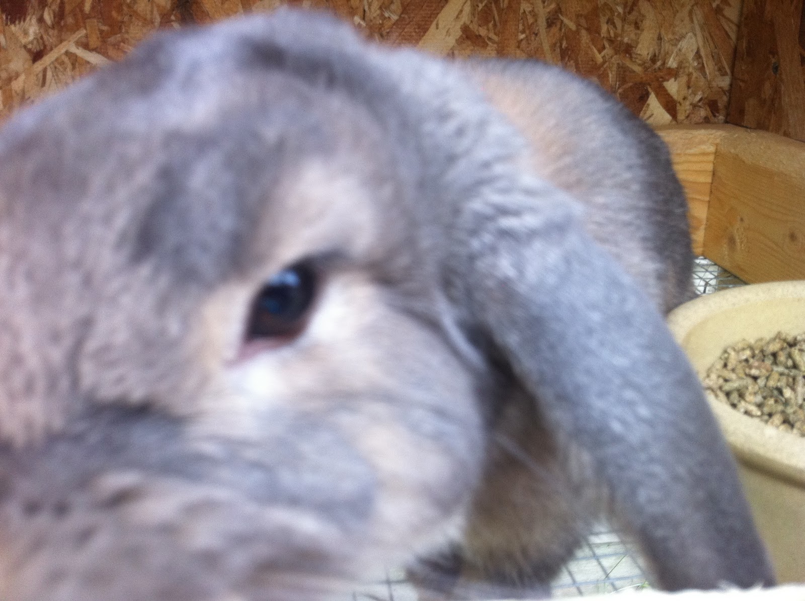
I couldn't find many of my photos. They're all in photographic form instead of digital. So, I found a picture of my bunny! This is Sir Orin Phil Jefferson Gazebo the First (My best friends named him) but I just call him Orin or Ori. He's a Blue Otter miniature lop. He's extremely curious and has a temper to boot.

Here's another picture of Ori. I really couldn't get him to stay still. He doesn't like it when you just stand there without petting him and he would not stop nudging the camera.

Sunday, November 21, 2010

Day One of Art Week: Drawing

For my first two years of college I was focused on getting an art degree. I have always enjoyed art, especially drawing with a simple pencil, and after high school I was certain that I wanted to pursue it as a career. However, a fine art degree, although it is a fun degree to work on, isn’t exactly practical. That is, unless you are what some people like to call “Financially Independent.” So, I switched to a graphic design degree. I was very happy with it for a while, until hours upon hours of trying to get a computer to do what I could do with my hand in seconds began to wear heavily on me. Eventually, I knew it was time to make a change. That’s when I switched to an English degree and I am very happy about that change.

Nevertheless, I still love art and I practice it whenever I can. So, I’m going to share a few pieces with you guys.

I’ve decided that all this week will be “Art Week” and each day I will pick a different method/medium and show you different pieces of my art that fall within that area.

Today’s method is Drawing!

All three of these drawings I did in my Drawing I and II classes. The subjects are boring, but the drawings turned out a lot better than I expected. (Sorry for the bad photography. The lighting in my rooms sucks.)

This is a form of subtractive art. I started by rubbing grated graphite all over the background. This is used as the medium tones in the drawing. Then, to get lighter tones, you erase or subtract the medium from the background, and to get darker tones, you add medium over the top. Everything is done in pencil/graphite. The focus of this piece was glare and reflective surfaces.


This is just a normal pencil drawing. I didn't start with a background, just plain white paper. The focus of this piece was matte surfaces and shadows. About five different lights were pointed at this still life in order to create all the criss-crossed and layered shadows. This is also one of the best pieces I drew in those classes.


This drawing was done using Conte crayon. It's a chalky-waxy kind of pencil that requires an aggressive hand, but allows you a limitless amount of control. I started with a grey sheet of paper and then added to it with black and white Conte crayon. The focus of this piece was metallic surfaces, hence all the tin and aluminum objects.

Tuesday, November 16, 2010

"Naomi" Banners

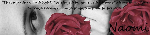
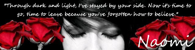
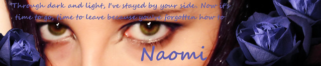
So, Dawn Zhang was the second person to ask for banners, this time to promote her story "Naomi" which is now available to read on WEbook.com. Go check it out if you get the chance. Any of the banners below will connect you to the page.

Originally, Dawn had this very pretty and dark picture of a girl holding a rose (It's currently the main cover for her book) but the image was unfortunately too small and I wasn't able to turn in into a banner without the image pixilating. However, I told her not to worry because I could replicate the same feel wtih different pictures. All three banners have at least three to five pictures that I layered on top of eachother in order to get the full effect. Then, I inserted the text which is the name of the story, "Naomi," and a poem Dawn really wanted on it as well. Enjoy!


Wednesday, November 10, 2010

"Entry into the Unfamiliar" Banners

Matt was the first person to ask for banners for his blog "Entry into the Unfamiliar." I've known Matt for a little while now so it was important to get the information on what he wanted on the banner and then finish them quickly for him. Each banner is pretty different. The first is actually a piece of concept art Matt doodled. The second, I found. It feels a little dark, but I think it can be interpretted in many different ways. Plus, you can't be a writer without being a bit dramatic. :) The third is from one of Matt's landscape pictures.

I personally loved how they turned out, and hopefully he will as well.

PS. All three banners will magically link you directly to Matt's blog. (That's what they're made for!)

PPS. The offer still stands for anyone else who would like banners made for their blog or website. Just leave me a comment and we'll talk about what to make you. :)


Tuesday, November 9, 2010

"WYE?" Banners

I remember making tons of these when I was into forums. I'd make banners for forum moderators so that people who came across their profiles could simply click on a banner and "BAM!" it would send them straight to the moderator's forum. So, I thought, why not do the same for blogs!

The two images at the bottom of this post are rather simple banners I created for my own blog (Hopefully you all can see them considering it took me a while to figure this all out again. If all you see are some strange computer codes that make almost no sense, it didn't work and I'm trying to fix it.)

There are a lot of different things you can do with these, but it usually starts with a picture, you add some text, sprinkle some virtual magic fairy dust and Bibbity-Boppity-Boo! you have a banner that will teleport all who click on it to your blog. :)

I'm going to keep making a few here and there just to do a bit of advertising, so if anyone is interested in having one made for any of their websites, just let me know. I'd be happy to throw one together for you!

What do you think?


Thursday, November 4, 2010

My Jewelry Line Is No Longer in Debt!

I recently discovered that my jewelry line is no longer in debt!

It takes quite a bit of money to start just about any amount of inventory, especially if that inventory is made of pure sterling silver. My original costs were for sterling silver beads, wire, clasps, crimps, and chain (the most expensive part). I already had the pliers I needed for bending the wire and I had the business cards I knew I would use to display the earrings and necklaces printed last year. After my first trip to Nawbin (a local bead store), I had spent $120. The next trip, I spent $40. Then, I sold two necklaces for $40 apiece, lowering my debt to $80. However, two more trips to Nawbin and 25 pairs of earrings later and I was $175 in debt. Luckily for me, I have great customers and in this week alone, I've sold $190 of inventory, releasing me from my debt, making me my first profit of $15. :)

This is a sampling of the earrings I am making. Every one an original piece and made entirely of sterling silver.
These are some of the pendants I have hand-crafted with a sterling silver meditation bead that rotates. Each is sold with its own 18" sterling silver chain. I have also started a new line that features glass beads instead of sterling silver.
This is a picture of my display and arrangement of jewelry sold exclusively at Salon West in Traverse City. Thanks for all the support, Salon West (and for the great haircut)!!!

For a link to Salon West, please visit my favorite links below. :)
And for more information on the Aubrie Anne jewelry line, please leave a comment or contact me at:
AubrieDesigns@aol.com